A calmer, clearer and faster digital experience for a family law firm.
A solo family-law practice had a website that read like a firm brochure — at the exact moment its visitors needed a guide. The work reframed the client journey and moved the frontend off Elementor onto GeneratePress and GenerateBlocks, migrating in place so every URL, page and piece of SEO equity survived the change.
Same content. A different reading experience.
Nothing was rewritten. The copy, the practice areas and the URLs are the ones the firm already had — what changed is the order they arrive in and how much work the visitor has to do to find what applies to them.
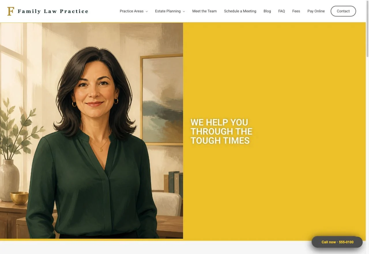
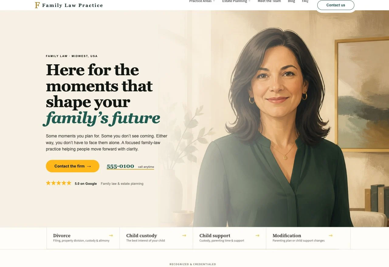
Client identity, contact details and imagery have been anonymized. The layouts shown are faithful recreations of the original pages.
A brochure, at the moment someone needs a guide.
“It feels more like a traditional law firm brochure than a client acquisition tool. I don’t think the site immediately connects with those concerns or clearly guides them toward contacting us.”
The firm’s owner, at kickoff
People land on a family-law site in the middle of a divorce, a custody dispute or a support modification. They arrive overwhelmed, and they are holding one question: can this firm help me, and what do I do next?
The old site answered neither quickly. Practice areas sat behind a dropdown, the attorney herself appeared well below the fold, reviews were not visible at all, and every heading on the page was set in capitals — which flattens hierarchy and makes a page harder to scan precisely when a visitor has the least patience for scanning it.
Underneath the design problem was a structural one. The frontend was built in Elementor, which meant every page carried the builder’s markup and asset weight, and any future change meant editing inside the builder rather than reusing a component.
Four decisions did most of the work.
Practice areas move to the front
The first thing a visitor sees is whether their situation is one this firm handles. Practice areas came out of the navigation dropdown and onto the page as a labelled index, so recognition happens in seconds rather than after a hunt.
Trust signals became visible, not implied
The attorney appears prominently and early — she was comfortable with that, and for a solo practice she is the offer. Alongside her: client reviews shown with their star ratings, and the credentials that actually differentiate her — guardian ad litem and mediator certifications, continuing-education speaking, and press coverage of a landmark case.
One next step, explained before it is asked for
The contact form is the primary action, with the phone number present throughout rather than parked on a contact page. The intake process is laid out as its own section — call, schedule, meet, review and sign, begin — because someone deciding whether to make that call wants to know what happens after it. The firm does not offer free consultations, so no call to action pretends otherwise.
Typography carries hierarchy again
Headings came out of all-capitals and into a real type scale, on consistently light backgrounds with no heavy dark breaks. The brief the owner gave was “clean, light, airy” — for an audience arriving under stress, the calm is functional, not decorative.
A migration in place, not a new site.
The site had years of accumulated search equity on URLs that were working. A from-scratch rebuild would have meant a new permalink structure, a redirect map to maintain, and a period of ranking volatility for a practice whose enquiries come largely from local search.
So the live site was cloned, and Elementor was swapped out for GeneratePress and GenerateBlocks in place, slug for slug. Blog posts were clean prose and moved across directly; the builder-made service pages were rebuilt as blocks. Almost nothing needed redirecting.
A new estate-planning practice area was added as a proper silo — one landing page with four service pages nested under it — using copy the owner had already written, used as supplied.
The contact form was written directly rather than pulled in from a form plugin: fewer moving parts, no plugin licence to renew, and no third-party script on the page carrying the firm’s most sensitive traffic. Scheduling runs through an embedded booking tool, and tag management was consolidated into the client’s own container so she owns her tracking outright.
The decisions that were not on the brief.
Migrate, don’t rebuild
A clean rebuild is faster to quote and easier to execute. Cloning and swapping in place is more fiddly, but it keeps the URLs, the media library and the rankings — which is what the client is actually paying to protect.
One go-live, not two
The signed proposal had the new homepage launching first, with the old builder still running the rest of the site. I argued against my own accepted terms: a visible stretch of two different designs and two performance profiles costs more credibility than a later launch does.
Catch the wrong address
The approved design carried a street address the firm had moved away from. Caught and corrected before build, not after a client walked to the wrong building — the kind of error a page builder will happily ship at any scale.
Sitting on a page builder you have outgrown?
Most of these rebuilds start the same way: the site still works, but every change is slow, the pages are heavier than they should be, and nobody wants to touch the URLs. That migration is a solved problem — it just has to be done deliberately.